Tuesday, December 9, 2008
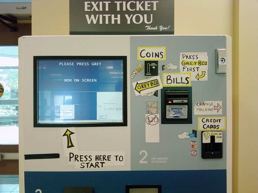
Users Fix Parking Ticket Machine
A nice short post about the usage of parking ticket machines and how users were able to fix the bad interface.
I believe the problem in this industry is the lack of standards on the interfaces. From my experience I always find new and very different interfaces in ATM machines, Ticket machines and so on. For exemple, the place you introduce coins is always different... This way is difficult to create standards and rules that help users understand the interfaces.
Wednesday, November 5, 2008
Labels
Let me share with you my perspective about the usability of labels in our blog.
When I first decided to put them on the blog, I was thinking that it would be most useful if we could see contents specially by: Good UX, Bad UX, Good CX and Bad CX, given the subject of our blog.
Of course there are some other useful tags like usability, accessibility, and they must also be added. My concern is, that our labels list doesn’t grow too much, unnecessarily and compromising usability.
My suggestion is that when we tag our posts, we try to find out:
- First - if one of this 4 main tags apply;
- Second - if there’s already an existing tag that fits our post;
- and Third - if we create a new tag, will it be useful for search in the future.
Does this makes sense to you? What do you think?
Talking about auto tagging: does anyone have a formed opinion about this subject? when to use, when to avoid, usability advantages versus usability problems.
Friday, October 24, 2008
SHIFT 2008 - Lisbon
It happened last week in Lisbon, an event gathering some experts in User Experience, Web communication and designers called SHIFT. Now we have a video with two guys from the organization staff doing a summary (in Portuguese) of the same event:
Following the steps of LIFT Conference iniciated in Geneva a few years ago, SHIFT puts Lisbon in the map of some brilliant people with good ideas to share with anyone interested in Web2.0, Usability, Web business models, and so on...
Friday, October 10, 2008
Links
Some inspiration...
http://www.100besteschriften.de/
Two Customer Experience consulting agencies:
http://www.fhios.com/
http://www.livework.co.uk/
At Live|Work they call it “Service Design”….
Irene Au is head of User Experience at Google, and she has this statement:
“My group has a mantra: Focus on the user, and all else will follow.”
http://www.fastcompany.com/fast50_08/google_irene-au.html
Wednesday, October 8, 2008
Nespresso, What Else!?
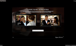
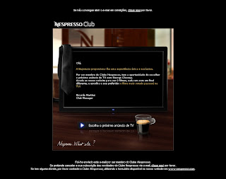
Just another good example of customer experience from Nespresso. This time the deal is to let Nespresso club members choose the next TV ad, from two similar videos (Mistaken or Cup) featuring George Clooney... of course!
First I got this email:
Than took me to this flash website:
...where I choose my favorite version of the TV ad.
Conclusion:
First, I found both the e-mail and website, non-intrusive and non-spam. Because I know the brand and my expectations about it are always positive.
Second, the voting process is very simple, and both videos load quickly. In general I took around 3 to 5 minutes in all process.
Third, what does Nespresso wants to say with this campaign?... is that the customer is important to them, so they let us choose the next TV ad...
What else!? :)
Tuesday, October 7, 2008
The silence
Last weekend I had a nice experience in one of Portugal's beatifull Pousada at Belmonte, on the countryside. What amazed me was the landscape and the silence, as I was just looking at Serra da Estrela with the sunset going on... I just aknowledge that most of the time - if not always - we hare surrounded by noise of any kind.
So this morning I got on Fertagus train to work, and for the first time in years this transportation company decided to put music inside the train, as we passengers cross the beautifull 25th April bridge...
PLEASE DON'T DO IT! Why do people think it's nicier to have music or radio in every single public space? like train stations, elevators, buses, and so on? We as citizens - not to mention as customers - deserve our noise-free space, because I believe noise is one of the main reasons for stress nowadays.
Hook and loop fastener
Citroën C1 2005 Commercial
Remember yesterday, on our weekly reunion when talked about the Citroën commercial?
This is the video:
"More Citroen C1 = more space = more free time
= less stress = more smiles = more love
= more Citroen C1. The first step por a better world"
I know it´s just a slogan... But at the end of the day, I believe that we too, take this kind of steps.
More conscious interface design = more user friendly interfaces = more free time = less stress = more smiles =...
Friday, October 3, 2008
The encouraging short chapters
Have you ever noticed the difference when you read a book with long chapters or short ones? If the two books have the same number of pages, and imagining that they are equally interesting, I’m most certain that you will be more motivated to read the one with the short chapters faster than the one with the long chapters.
What happens is that when the reader finishes a chapter and the next one is short, even if apparently he doesn’t have the time for it, he just thinks “well, the next chapter is JUST 2 pages long” and he keeps reading. If the next chapter is long he’ll just leave it for latter.
Chapter’s endings are seen as milestones, and people usually don’t like leaving them unfinished. If you want to encourage people, with lack of time, to read your content, write short paragraphs and short chapters.
Thursday, October 2, 2008
Nintendo Wii is a Blobject
As some people in our team got a Nintendo Wii last weekend as a prize from our company - me included, yeah! - I stumble upon some interesting posts about this console. First this product is categorized as a Blobject... And you all ask: What is that!?... just read this entry on Wikipedia.
But Nicolas Nova, a blogger you will hear about a lot in this blog, as found some fascinating similar consoles:
But Nicolas finds these consoles out of the category (Blobject) as they present a poor design ripped from the Wii, and he claims that gestural interactionwasn't the only innovation on Wii. It's also the console design, the games, the name, and so on...
These two consoles, called Technigame (even the name was badly chosen because they don't give any clue about the features of the product) just have one strong argument for buyers: the lower price.
On the other hand, I find the gestural interface a huge step forward on console games, as it got the chance to seduce other kind of players such as... my mother, who turns 60 this year. It's funny to see that suddenly this older people who grew up with out video games, saw an interesting feature on these games.
"We, designers get excited about our creativity but users appreciate creativity after they are happy with the usability"
Hello to all, I'm gonna start my participation sharing 2 things, 1º the sentence above.
It's already known by all of us, but I think it's never too much to remember ;) And 2º, a realy nice tool for every webdesigner that cares about usability. A checklist with 88 questions...and don't be surprise if you find out that the mistakes are often the same!!!
This checklist is a little bit long, but is easy to read because it´s organized by themes such as: Technical, Images, Content, Navigation, Structure, Forms, Multimedia and Extra features.
Here's a small hint of what you can find in this list:
"... Did you check your website in at least IE, FF, Opera and Safari?
Did you use EM or percentages instead of PX?
Did you create enough contrast between the text and the background?
Did you make a distinction between links and plain text?
Did you use breadcrumbs if you have a large amount of pages?
Did you make your logo link to your homepage?
Did you make sure that music and videoclips can be turned off at any time?
Did you make a site map?..."
http://stud.cmd.hro.nl/0773253/notusable/blog/the-ultimate-webdesign-usability-checklist/
Sentence from http://www.vijayweb.com/
See you soon!
Wednesday, October 1, 2008
Zapping and Fast-forwarding
The zapping phenomenon first appeared because people wanted to avoid television commercial breaks. With the increasing number of information and entertainment providers, and facilitated access, people became so eager for information and stimulus, that they don’t only avoid the commercials, they zap in the middle of TV shows, movies and every time they lack that stimulus.
With magazines, books, journals and web-sites, the behavior is exactly the same. We read the headlines, and the “bolds” and we keep fast-forward.
This brings me to the subject of “Content-design”. We must adapt not only the image and functionality to create stimulus, but we also have to adapt the content to the fast-forward reading style. This applies not only for the web-sites, as it is always associated, it applies to everything, from article writing to email writing, users manuals, proposals, reports, etc.
So, if you really like to write long paragraphs, I guess you will be more successful writing romances. All the rest will need bulleted lists, numbered lists, summaries, info-graphics and illustrations.
Tuesday, September 30, 2008
Kick-off
Ok, UX guys. Let’s put in some good and bad experiences.
Because a picture is worth a thousand words, I suggest that you take photos any time you can.
Subscribe to:
Posts (Atom)