
Friday, April 29, 2011
Monday, November 29, 2010

Thursday, October 15, 2009
UX em roupa de bébé
Não há forma de não pensar constantemente em UX, mesmo estando de licença de maternidade. Antes do meu bébé nascer procurei por todo lado roupinhas fáceis de vestir e confortáveis para ele. Parece uma coisa fácil, e deveria sê-lo, mas na verdade não há muitas marcas que cumpram os requisitos. Fiquei surpreendida com a falta de empatia que os designers de moda infantil têm com os bébés e pais. Passo a exemplificar:
- Na grande maioria das lojas só se vende roupa com sistema de molas de fechar nas costas. Ora os bébés passam a maior parte do tempo deitados de costas ou sentados com as costas encostadas. Tentem agora imaginarem-se deitados ou encostados, tendo uma camisa vestida com molas pelo meio das costas abaixo. E já agora imaginem as molas em proporção com o vosso tamanho (mais ou menos o equivalente a umas tampas de garrafa de água. Então, que tal?
- Roupa de fechar atrás também não é muito fácil de vestir principalmente para pais com pouca experiência, pois é preciso estar a dar voltas ao bébé.
- Algumas aplicações e bordados que enfeitam tando os fatinhos dos bébés às vezes são tão espessos que parecem escudos de protecção. Não deve ser muito confortável ir para a cama com colete de balas...
- As famosas etiquetas que irritam crianças e adultos, também estão nas roupas dos bébés e por vezes em materiais que picam mesmo. É chato ter de cortar as etiquetas porque dá jeito manter as instruções de lavagem ou até saber o tamanho da peça para que possa ser reutilizada futuramente.
Como cliente e tendo visto roupa de várias marcas e lojas para bebé como Pré-Natal, Chicco, Petit Patapon, Absorba, Timberland, Zippy, C&A e Benetton, dou 5 estrelas à Absorba pela originalidade, beleza, funcionalidade, conforto dos materiais e impressão da informação da peça no interior da própria roupa evitando assim as etiquetas. (A Zippy, em muitas das peças, também imprime em vez de usar etiquetas).
As que mais impressionam pela negativa são a Chicco e a Pré-natal onde não encontrei um única peça que não fosse de apertar nas costas!
Bora lá fazer roupinha "usável" para os bébés que precisam que estejemos atentos às suas necessidades, porque eles não se podem queixar.
Saturday, May 9, 2009
Tuesday, February 10, 2009
Why is eye-tracking important?
BBC has a short film on that subject. Compiled in just two minutes, find out why your navigation menus should be at the top, or left column.

Watch the video "The eyes have it"

Watch the video "The eyes have it"
Tuesday, December 9, 2008
Users Fix Parking Ticket Machine
A nice short post about the usage of parking ticket machines and how users were able to fix the bad interface.
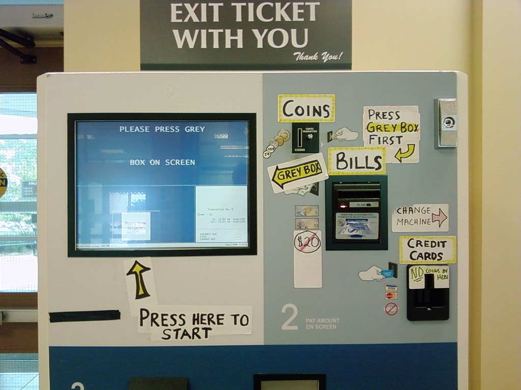
I believe the problem in this industry is the lack of standards on the interfaces. From my experience I always find new and very different interfaces in ATM machines, Ticket machines and so on. For exemple, the place you introduce coins is always different... This way is difficult to create standards and rules that help users understand the interfaces.
I believe the problem in this industry is the lack of standards on the interfaces. From my experience I always find new and very different interfaces in ATM machines, Ticket machines and so on. For exemple, the place you introduce coins is always different... This way is difficult to create standards and rules that help users understand the interfaces.
Wednesday, November 5, 2008
Labels
Let me share with you my perspective about the usability of labels in our blog.
When I first decided to put them on the blog, I was thinking that it would be most useful if we could see contents specially by: Good UX, Bad UX, Good CX and Bad CX, given the subject of our blog.
Of course there are some other useful tags like usability, accessibility, and they must also be added. My concern is, that our labels list doesn’t grow too much, unnecessarily and compromising usability.
My suggestion is that when we tag our posts, we try to find out:
- First - if one of this 4 main tags apply;
- Second - if there’s already an existing tag that fits our post;
- and Third - if we create a new tag, will it be useful for search in the future.
Does this makes sense to you? What do you think?
Talking about auto tagging: does anyone have a formed opinion about this subject? when to use, when to avoid, usability advantages versus usability problems.
Friday, October 24, 2008
SHIFT 2008 - Lisbon
It happened last week in Lisbon, an event gathering some experts in User Experience, Web communication and designers called SHIFT. Now we have a video with two guys from the organization staff doing a summary (in Portuguese) of the same event:
Following the steps of LIFT Conference iniciated in Geneva a few years ago, SHIFT puts Lisbon in the map of some brilliant people with good ideas to share with anyone interested in Web2.0, Usability, Web business models, and so on...
Following the steps of LIFT Conference iniciated in Geneva a few years ago, SHIFT puts Lisbon in the map of some brilliant people with good ideas to share with anyone interested in Web2.0, Usability, Web business models, and so on...
Friday, October 10, 2008
Links
Some inspiration...
http://www.100besteschriften.de/
Two Customer Experience consulting agencies:
http://www.fhios.com/
http://www.livework.co.uk/
At Live|Work they call it “Service Design”….
Irene Au is head of User Experience at Google, and she has this statement:
“My group has a mantra: Focus on the user, and all else will follow.”
http://www.fastcompany.com/fast50_08/google_irene-au.html
Wednesday, October 8, 2008
Nespresso, What Else!?
Just another good example of customer experience from Nespresso. This time the deal is to let Nespresso club members choose the next TV ad, from two similar videos (Mistaken or Cup) featuring George Clooney... of course!
First I got this email:
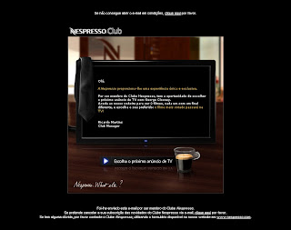
Than took me to this flash website:
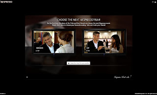
...where I choose my favorite version of the TV ad.
Conclusion:
First, I found both the e-mail and website, non-intrusive and non-spam. Because I know the brand and my expectations about it are always positive.
Second, the voting process is very simple, and both videos load quickly. In general I took around 3 to 5 minutes in all process.
Third, what does Nespresso wants to say with this campaign?... is that the customer is important to them, so they let us choose the next TV ad...
What else!? :)
Tuesday, October 7, 2008
The silence
Last weekend I had a nice experience in one of Portugal's beatifull Pousada at Belmonte, on the countryside. What amazed me was the landscape and the silence, as I was just looking at Serra da Estrela with the sunset going on... I just aknowledge that most of the time - if not always - we hare surrounded by noise of any kind.

So this morning I got on Fertagus train to work, and for the first time in years this transportation company decided to put music inside the train, as we passengers cross the beautifull 25th April bridge...
PLEASE DON'T DO IT! Why do people think it's nicier to have music or radio in every single public space? like train stations, elevators, buses, and so on? We as citizens - not to mention as customers - deserve our noise-free space, because I believe noise is one of the main reasons for stress nowadays.
Hook and loop fastener
 Here's a good UX!
Hook and loop is the ideal shoe fastener for children who have not yet learned to tie shoelaces.
It makes them feel autonomous and it saves parents time when they’re in a hurry to leave.
It makes them feel autonomous and it saves parents time when they’re in a hurry to leave.
Citroën C1 2005 Commercial
Remember yesterday, on our weekly reunion when talked about the Citroën commercial?
This is the video:
"More Citroen C1 = more space = more free time
= less stress = more smiles = more love
= more Citroen C1. The first step por a better world"
I know it´s just a slogan... But at the end of the day, I believe that we too, take this kind of steps.
More conscious interface design = more user friendly interfaces = more free time = less stress = more smiles =...
Friday, October 3, 2008
The encouraging short chapters
Have you ever noticed the difference when you read a book with long chapters or short ones? If the two books have the same number of pages, and imagining that they are equally interesting, I’m most certain that you will be more motivated to read the one with the short chapters faster than the one with the long chapters.
What happens is that when the reader finishes a chapter and the next one is short, even if apparently he doesn’t have the time for it, he just thinks “well, the next chapter is JUST 2 pages long” and he keeps reading. If the next chapter is long he’ll just leave it for latter.
Chapter’s endings are seen as milestones, and people usually don’t like leaving them unfinished. If you want to encourage people, with lack of time, to read your content, write short paragraphs and short chapters.
Thursday, October 2, 2008
Nintendo Wii is a Blobject
As some people in our team got a Nintendo Wii last weekend as a prize from our company - me included, yeah! - I stumble upon some interesting posts about this console. First this product is categorized as a Blobject... And you all ask: What is that!?... just read this entry on Wikipedia.
But Nicolas Nova, a blogger you will hear about a lot in this blog, as found some fascinating similar consoles:


But Nicolas finds these consoles out of the category (Blobject) as they present a poor design ripped from the Wii, and he claims that gestural interactionwasn't the only innovation on Wii. It's also the console design, the games, the name, and so on...
These two consoles, called Technigame (even the name was badly chosen because they don't give any clue about the features of the product) just have one strong argument for buyers: the lower price.
On the other hand, I find the gestural interface a huge step forward on console games, as it got the chance to seduce other kind of players such as... my mother, who turns 60 this year. It's funny to see that suddenly this older people who grew up with out video games, saw an interesting feature on these games.
But Nicolas Nova, a blogger you will hear about a lot in this blog, as found some fascinating similar consoles:
But Nicolas finds these consoles out of the category (Blobject) as they present a poor design ripped from the Wii, and he claims that gestural interactionwasn't the only innovation on Wii. It's also the console design, the games, the name, and so on...
These two consoles, called Technigame (even the name was badly chosen because they don't give any clue about the features of the product) just have one strong argument for buyers: the lower price.
On the other hand, I find the gestural interface a huge step forward on console games, as it got the chance to seduce other kind of players such as... my mother, who turns 60 this year. It's funny to see that suddenly this older people who grew up with out video games, saw an interesting feature on these games.
Subscribe to:
Posts (Atom)